
slim chances

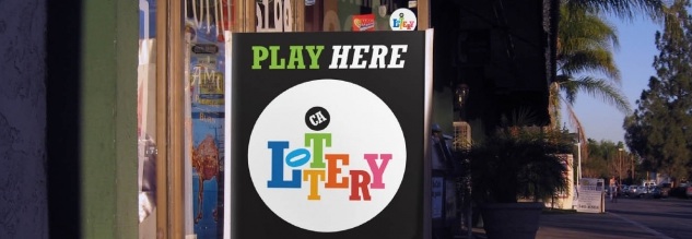


The California Lottery has a new logo (the top photo - stolen from Jon Victorino's flickr photostream). A lot of people are referring to it as being web 2.0 (another way of saying its passe), because it looks like an icon in the dock on your computer or phone. To me, that makes it pretty dismal, though it does deserve some credit for being an improvement over the old one. But it's one of those cases where you think, 'well a Lottery logo has to be cheesy and bad to get across what it is' I guess in the same vein that you might expect gaudiness from a casino. UnderConsideration's blog 'Brand New' did a write up about the logo, but in the comments, someone pointed to this design that Bob Dinetz Design did for ad agency BBDO. (I am assuming it is a proposal that wasn't chosen.) Its a great piece of proof that fun doesn't have to be cheesy. Its clean, sharp, bright, and has layers of meaning - many winners, many games, maybe even many peoples - but overall - fun. I don't know if the odds were ever any better of this being chosen than of actually winning the lottery, but its nice to see a smart execution presented for something that too many expect to be dumbed down.