
well covered
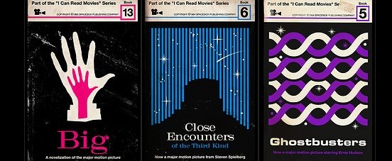

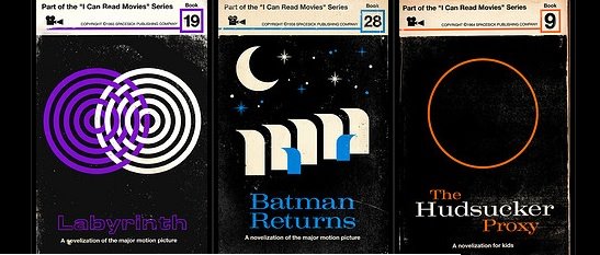
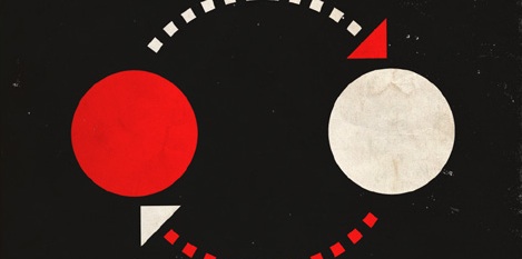
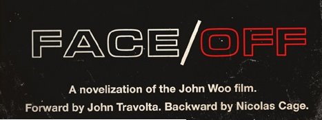
These are so outrageously smart and beautiful that I just don't know what to write about them. I ran across this via FontFeed - these are the work of a designer (I dunno if he calls himself that, but I do) named Mitch Ansara, aka Spacesick. He takes movies and creates fictional bookcovers from the 60's as if they had been novels that existed in that time. Some crazy things - for as spot on as he gets the visual references, and as brilliantly as he captures the overall essence and key elements of each story with a simple illustration, he says he has no "experience, training, or confidence in graphic design or type...". Seriously, just crazy. On top of that, his designs use the typefaces Microgramma (the precursor to Eurostyle) and Craw Modern, released in 1951 and 1958 respectively. Yet the fact that he is historically accurate with his choices is just a testament to how well tuned his instinct is - he says he didn't research the dates. Check out more of his covers in the link below, and even more on the link to his Flickrstream.