so refreshing
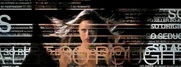
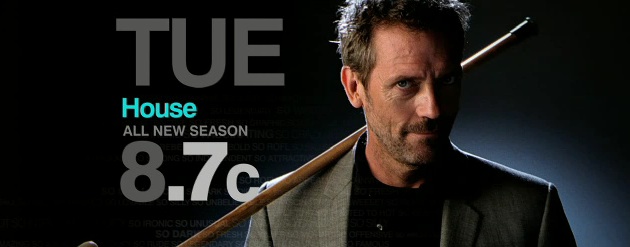
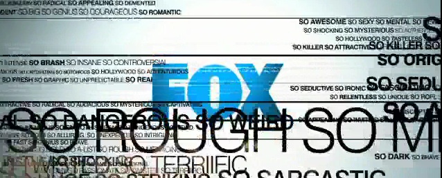
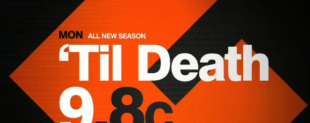
I've been meaning to highlight this work for a while... Fox Broadcasting has been using a really nice graphics package since last fall that the more I see, the more I love. Since there's not much on Fox besides 24 and Idol, you might not have seen it before January. There's a lot to love in this package, but what anchors it are a lot of really well-designed screens of information that clearly and boldly (and beautifully) communicate their information, usually (smartly) giving the most priority to the day and time, but always with simple but very well laid out compositions of typography. But the type has a double life in the package, because a lot of the flavor comes from very complex transitions which themselves are made of type. These transitions become a thematic link among various palettes and elements and help to both provide energy and consistency within the package. Those lines of type are also found within the foreground and background of resolved compositions, again creating a subtle link throughout the elements. And best of all - and testament to how well-designed the compositions are - is what's not used and not missed in this package: no gratuitous 3D, no light effects, no lens flares. By not using them, they've created a look that stands apart from the others. For the sake of tempering my gushing, the package does have some minor flaws - there are some poorly kerned elements that somehow made it in with the otherwise nicely kerned ones, and there is one composition that every time I see it I swear its the NBC peacock; but overall, its a package that is refreshing to see (and see used so well) on a broadcast network. The package was designed by Troika Design Group, one of the kings of broadcast design (I don't know the individual designer or designers to credit). You can see a montage reel of the look here:

