
a sign?
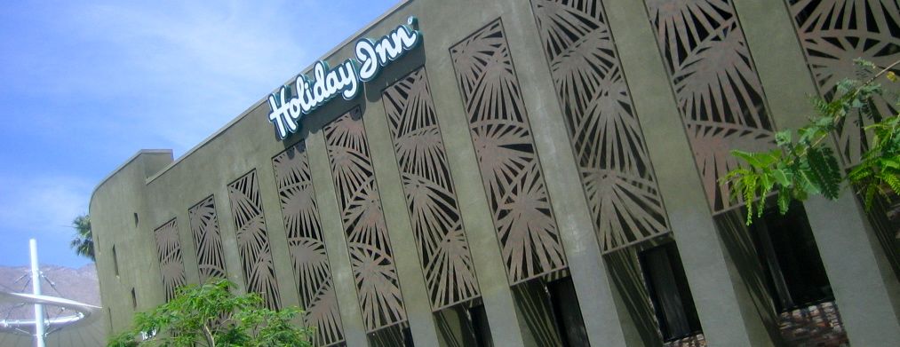
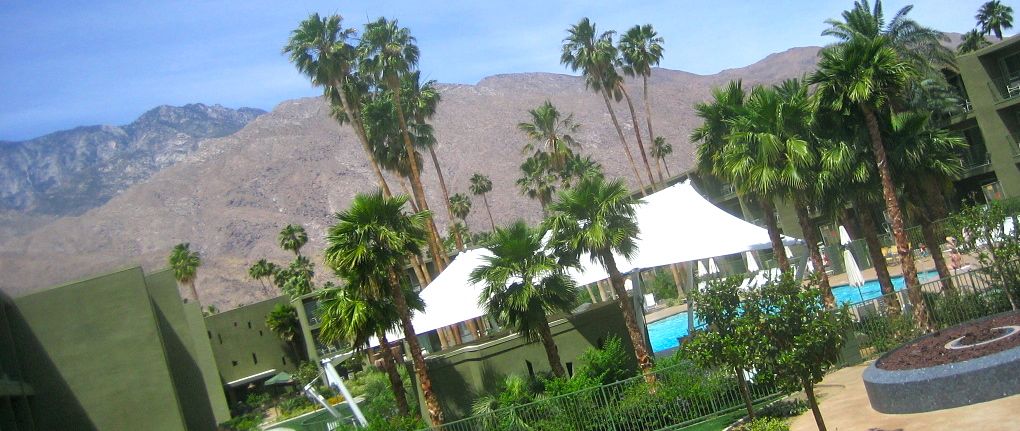
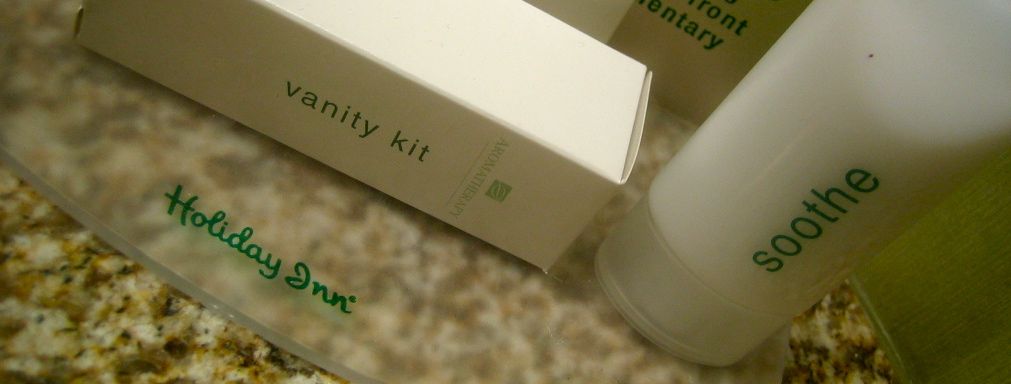


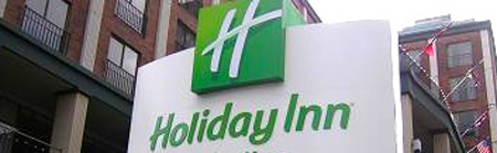
I don't think I ever expected to write a post about a Holiday Inn, but our host hotel for the rodeo in Palm Springs was a Holiday Inn, and I have to say I was pretty surprised by how nice it was. Apparently it used to a be a not so nice Ramada and was remodeled in 2007 into a Holiday Inn. Whether this is a one of a kind example or more an example of where Holiday Inn's are going, I have no idea, but the hotel was nice enough to merit mention. I know granite counters and slate tiles are so 5-years-ago, but I still appreciate how finishings like that can change how a hotel room feels. And I think the curved shower curtain rod is one of the best inventions ever. I hope the guy that came up with that one is living well. Another sort of odd feature was the pillow buffet - complete with a menu explaining the different types of pillows on the bed. Beyond that, the furnishings throughout the hotel were surprisingly tasteful. Holiday Inn announced a logo and design change last year, moving to a more budget-style inexpensive image featuring an H that reflects a highway interchange, so that this hotel was so nice was a surprise. There was no sign of the new logo anywhere in the hotel, even the internet access site still featured the familiar script and star, but the company site does feature a section about the new look 'coming'. If the interior of this hotel is any indication, Holiday Inn's may be getting a lot nicer than their new design suggests.