
impressionist


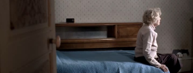

I have to apologize if this post is a mood killer, but this is such a strong piece (and so different than we would ever see in the US) that it deserves notice. Adfreak.com today featured a recent PSA by Saatchi & Saatchi Paris for the French Alzheimer's Association. Its a bravely honest and brutally powerful glimpse at the ugliness of Alzheimer's. No sugarcoating, but then again, the French have never been known for sugarcoating. AdFreak compares it to a British PSA, which in fairness is probably similar to what we would typically see in the US. Its pretty clear which one leaves the lasting impression. It reminds me of a professor in one of my design classes making the point that design is about communication, not making things pretty. If the message isn't pretty, the design shouldn't be either.