
make some fun
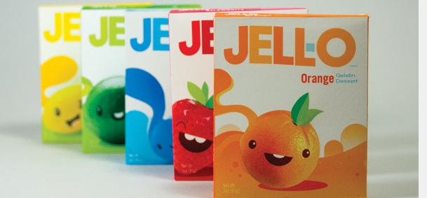
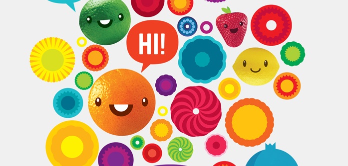
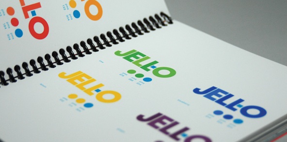
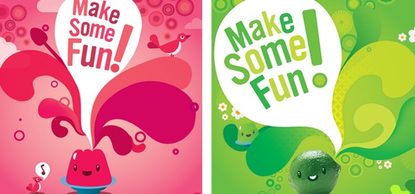
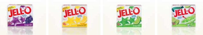
Another found on the web spotlight today - this is a really great rebrand of Jell-o packaging found on UnderConsideration's website 'Brand New'. The worst thing about it? It's not real. This is student work. Seriously. It was created by designer Richard Perez, who recently graduated from San Francisco's Academy of Art University. I didn't even realize how bad Jell-o's packaging had become (last image above), including their adoption of a swirled O logo (wtf?), until researching this post. What Perez has done here is a great job of balancing a lot of fine lines - fun but not tacky or cheesy, clean but still energetic and exciting. I love the use of color tones within the logo and within words that don't stray from the base color to give some energy but still maintain legibility. The use of characters that reflect urban pop art is also a brilliant bridge of child to adult, smart but still playful. It looks like the logo has a subtle baseline shift in it that I might take issue with if this were an actual rebrand, but it's not, so I won't. Nice job on a really great brand system that captures the character and soul of the product better than the actual product's packaging does.