
cleanup on aisle 4
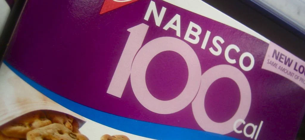
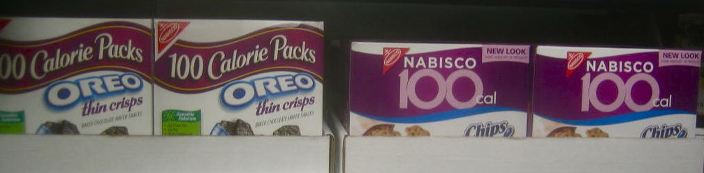
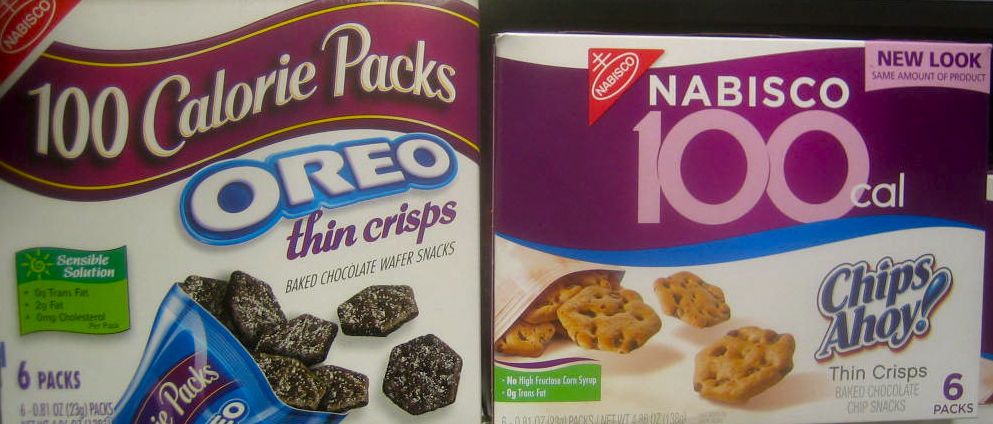
There's something I enjoy about catching package redesigns - especially when I find both the old and new on a shelf together. Seeing both designs in the context they were made for is always better than seeing studio shots of them. While this is no Coca-Cola redesign, I noticed a nice update to Nabisco's 100 Calorie snack packs the other day that I assume will start appearing across the line. The old design was typical of most grocery packaging - overdone typography with shading, outline, highlight, drop shadow and every gimmick in the book, multiple unrelated typefaces, and too many elements arranged in ways that give no clear hierarchy or natural way to guide the eye. While the new one maintains some of those, they are mostly reduced to the product logo. The product itself now gets more prominence by eliminating the unnecessary distraction of the bag label and cleaning up the surrounding elements to make the label easier to read with clear priorities. Most importantly, they have given greater priority to the 100 Calorie pack branding with a much cleaner and pretty nice typographic arrangement that shockingly has no edging, shadows, etc. I'm a little unsure of the tricky slicing out of the center 0 from the other numbers. I'm sure it was a solution to ease someone's rejection or discomfort of the extreme tight letterspacing merging the numbers together, but is it also showing the center 0 to be fat? On a calorie-conscious package? Regardless, the disappearance of the typical tricks and gimmicks and appearance of some nice typography is to be applauded and hopefully a sign of a new trend.