
icing
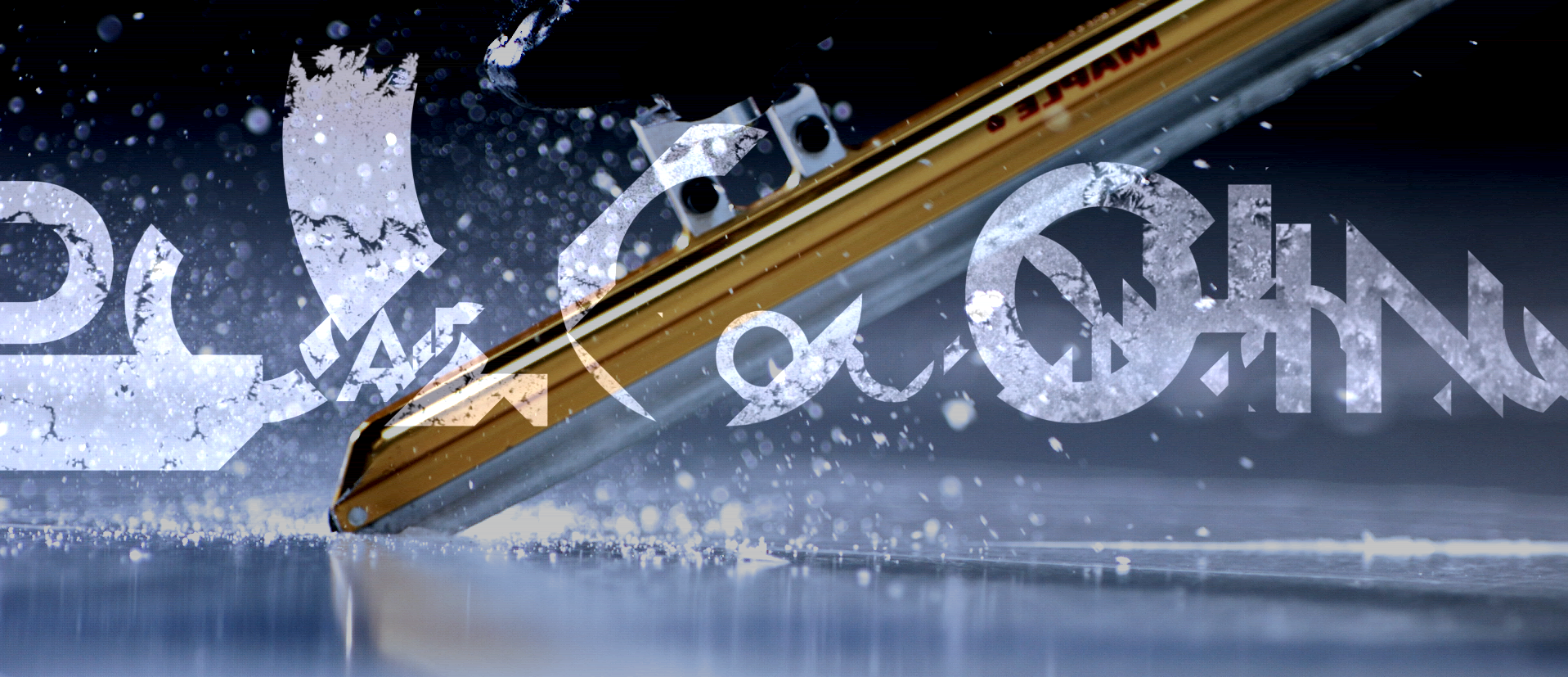
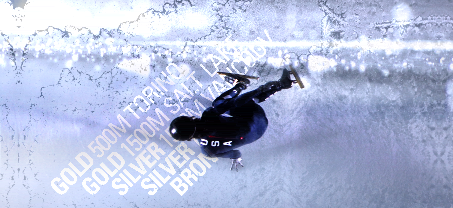
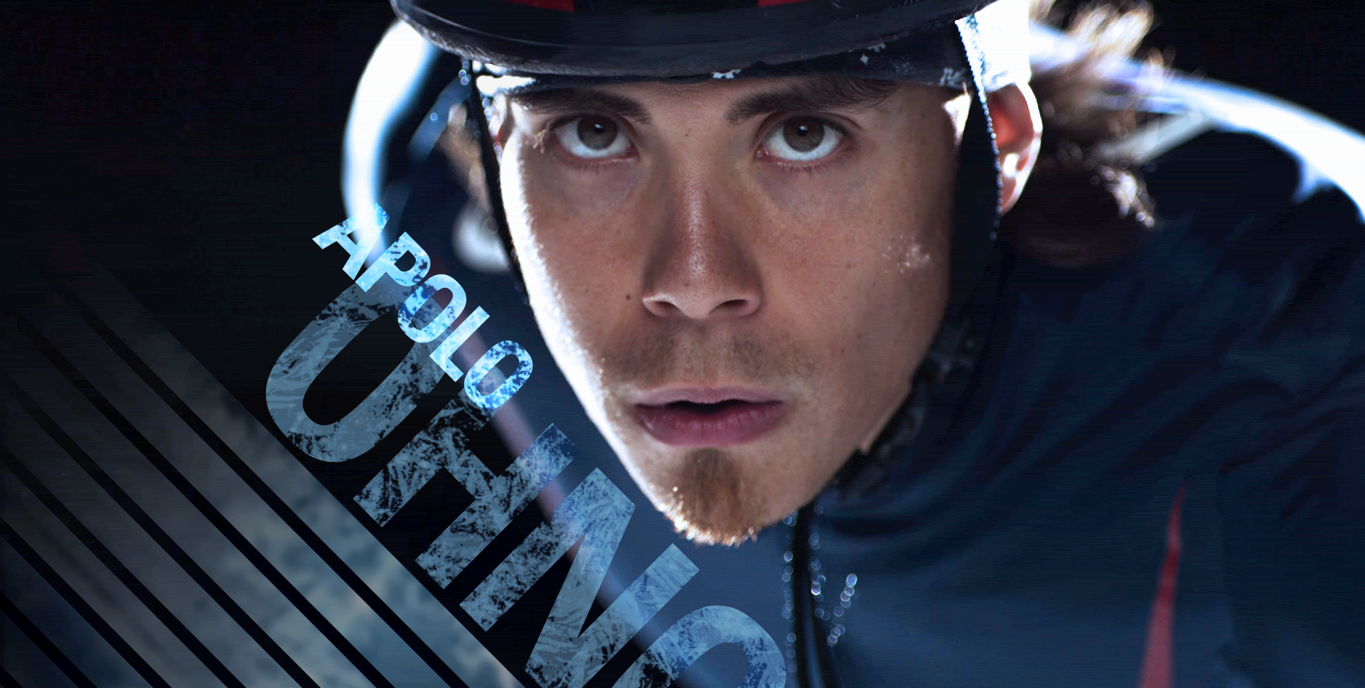
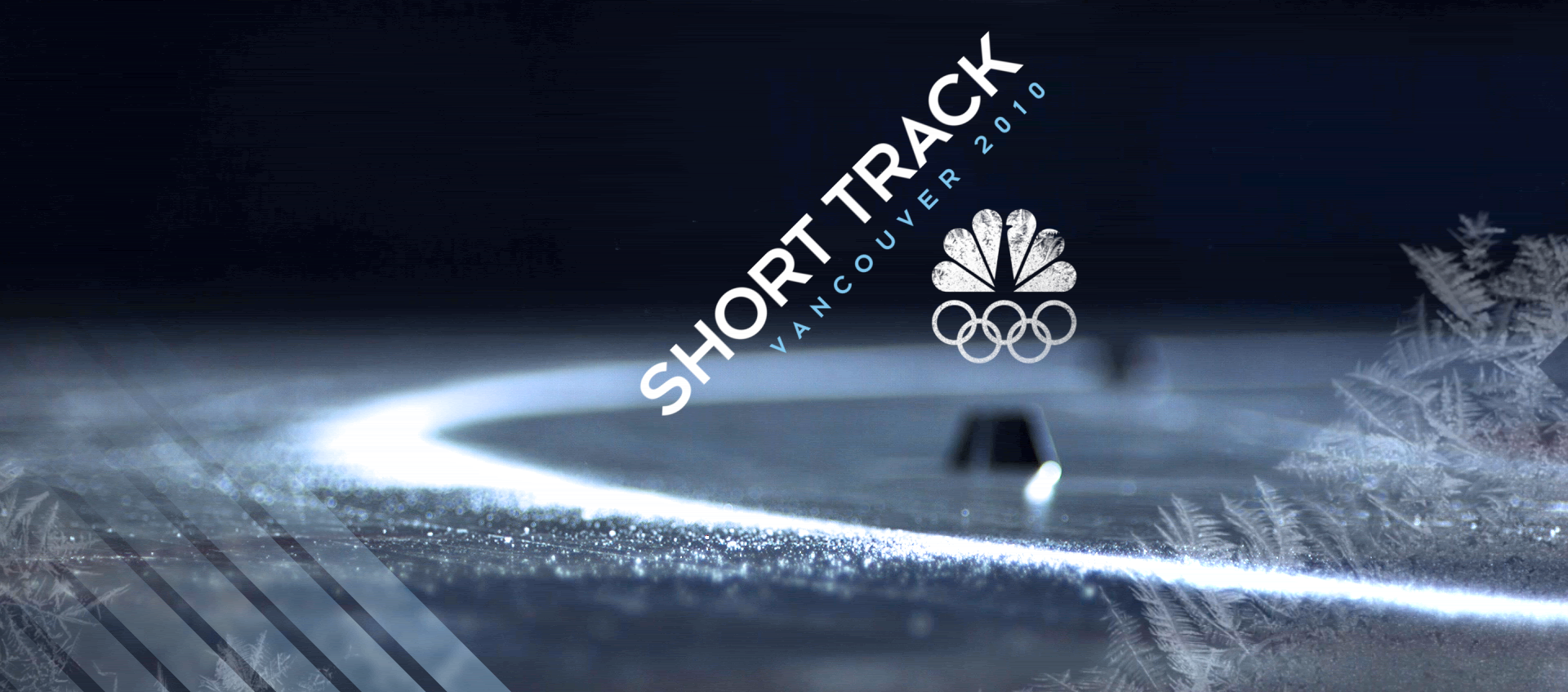
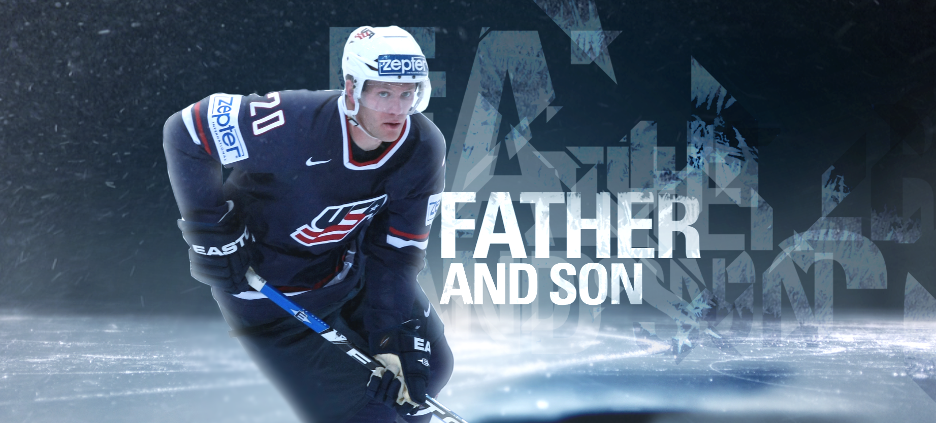
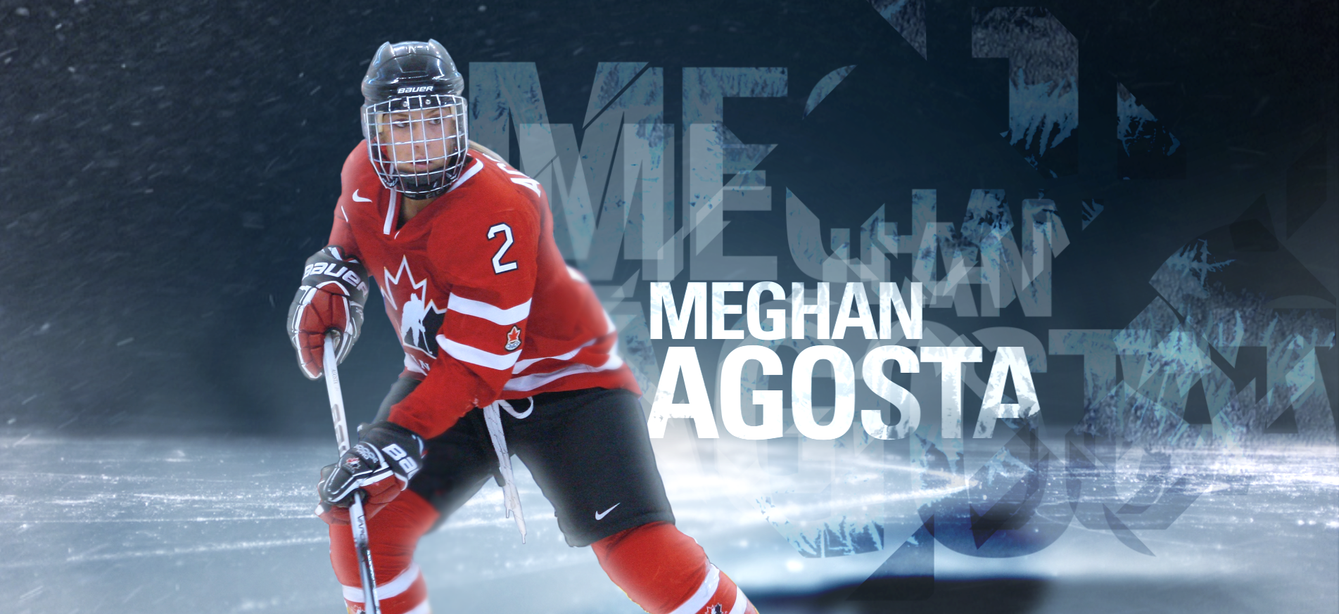
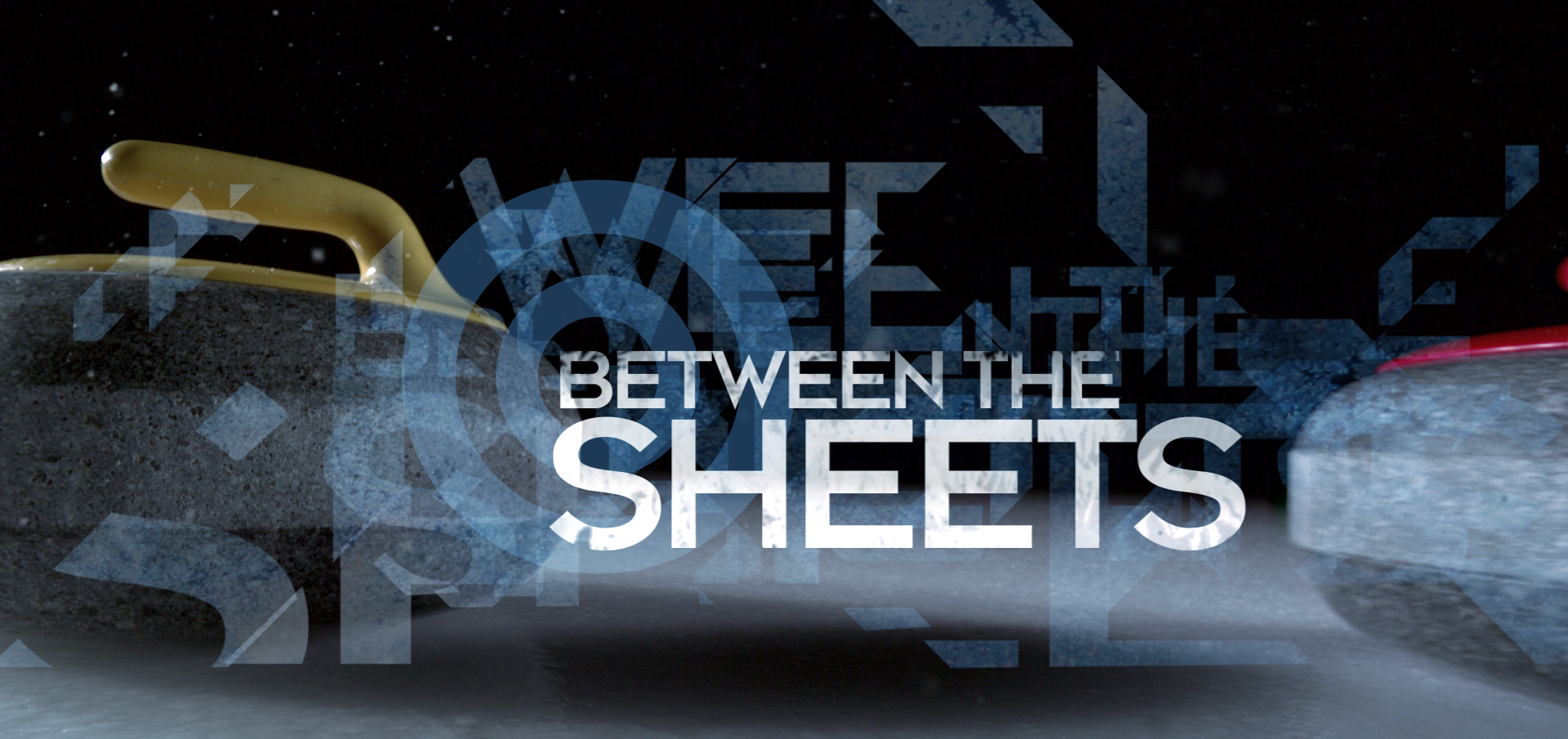
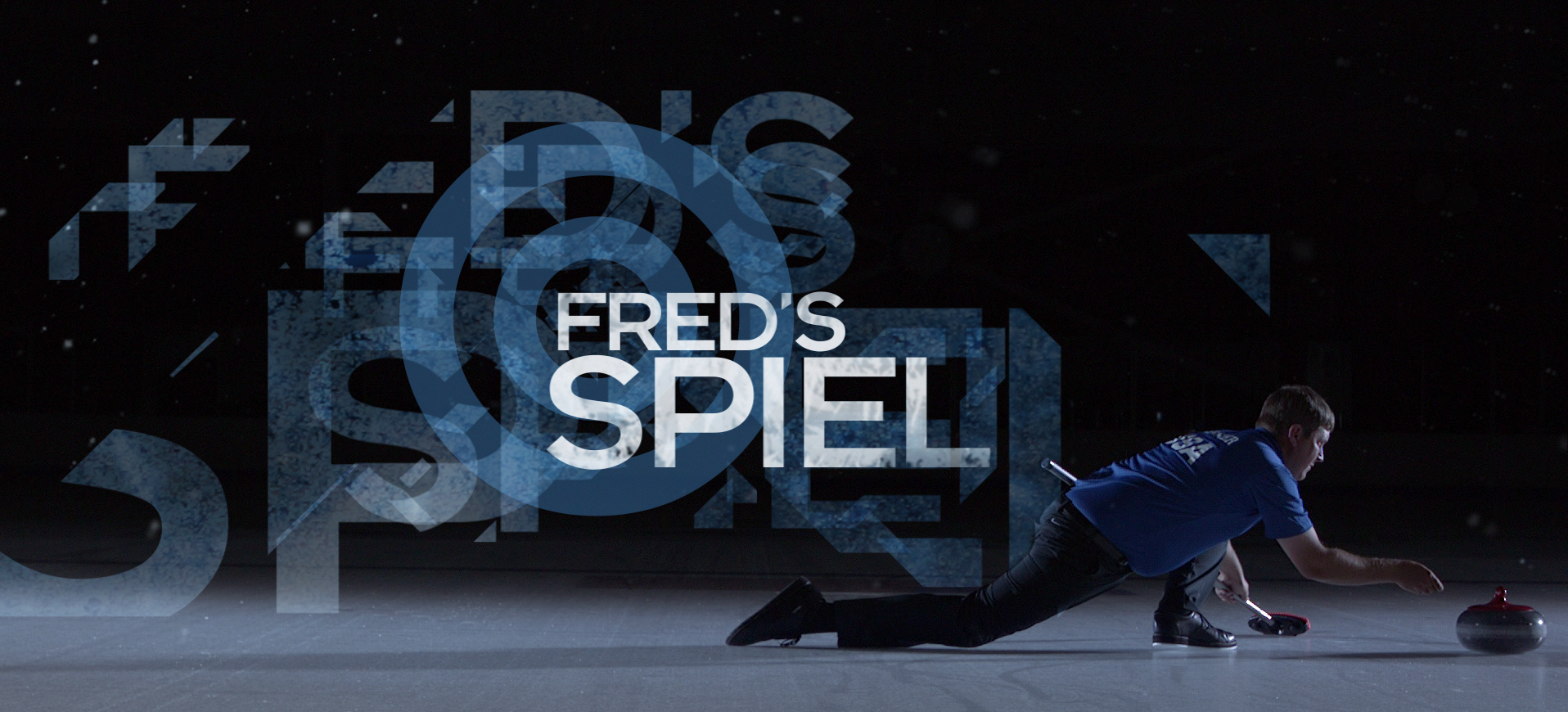
Finally getting around to posting some examples of some of what I've been up to lately. Sorry again for the lack of posts, but I guess I can't keep apologizing every time; thank goodness for Twitter for allowing a way to keep updates much more current about whats going on. If you've been watching the Olympics, you've seen that the look is based on ice crystals and diagonal patterns that actually originated from plaid (though the plaid never made it through the concept stages, the diagonals lived on). The look was designed by my friends Dave Barton and Art Director John Schleef of NBCOlympics. After the games, I'll try to do a more comprehensive post on the look overall. My role is just one of several designers to work within their look and develop pieces that work directly with it, sometimes in very direct ways and other times in ways that may take their elements but push them in different ways. The first few stills are just from an Apolo Ohno bumper; the next are from some hockey graphics that originally were just a couple requested graphics, but now are starting to develop into a mini-package of its own; and then a couple curling segment openers that also found some derivation in the stuff that was done for hockey. We never know day by day what exactly we'll be doing next, but chances are I'll be moving into more bumpers. Either way, in the next few days I'll try to post more frames as well as some of the advertiser sponsored elements that were done prior to the start of the games.