
which side?

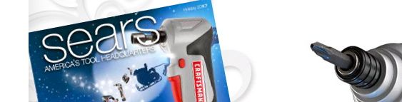
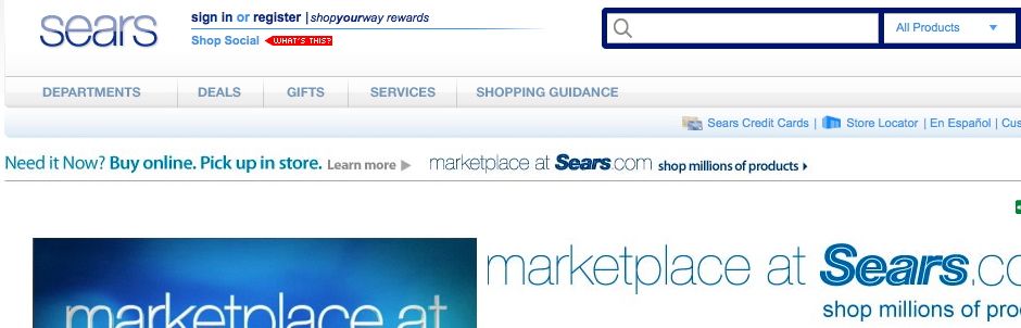


It seems that Sears may have a new logo - introduced in much the same way the Gap logo redesign was. What, no furor from people who probably have no business judging design anyway? Well, lets hope not. Okay, snarkiness aside, I think it is kind of interesting. I first noticed the logo on the tag of a tv commercial recently, and then checked the website wondering if it was just in that commercial or if it was a new logo - the website showed the same logo. Admittedly, I don't know the last time I had been to the Sears website or a store, so I don't know how recent the change is. And with not seeing the logo in a store or on bags etc, its unfair to judge it completely (much like the Gap logo.) I did find it used in several applications, though the old logo also still shows on many others (sometimes both in the same place.) It seems to be a soft rollout and gradual change. And my perception of Sears is of it having an image problem for twenty years, so its hard to fault them for the need to make a change. Their last logo has been around since 2004 (last pic above), when they shifted their previous all-caps double-stroke logotype from 1984 to upper and lower case (complete with a red swoosh, which mercifully disappeared later.) It still felt dated, and I don't know that it did much to change the image of Sears away from "where Grandma buys her pantyhose." At the same time, its a tough challenge: how does Sears show its 'softer side', yet still address its successful hardware and automotive side? Part of me thinks their previous 1969 logo has some equity and is still clean and classic enough to work today - and work for both sides, but I'm curious to see how this new logo plays out. While decidedly leaning to the feminine side, will it be used it different weights to feel more masculine in certain environments? It at least seems an improvement over the previous logo, though that's not saying a lot. It's an odd situation - from the challenge to the rollout to the solution. Maybe I'm being too forgiving in an attempt not to be Gap-like-reactionary. But let's wait and see.