
flying colors
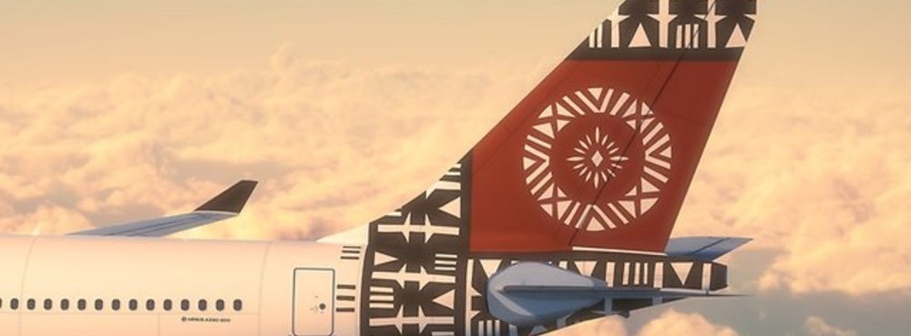
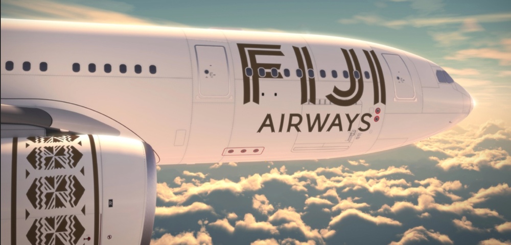
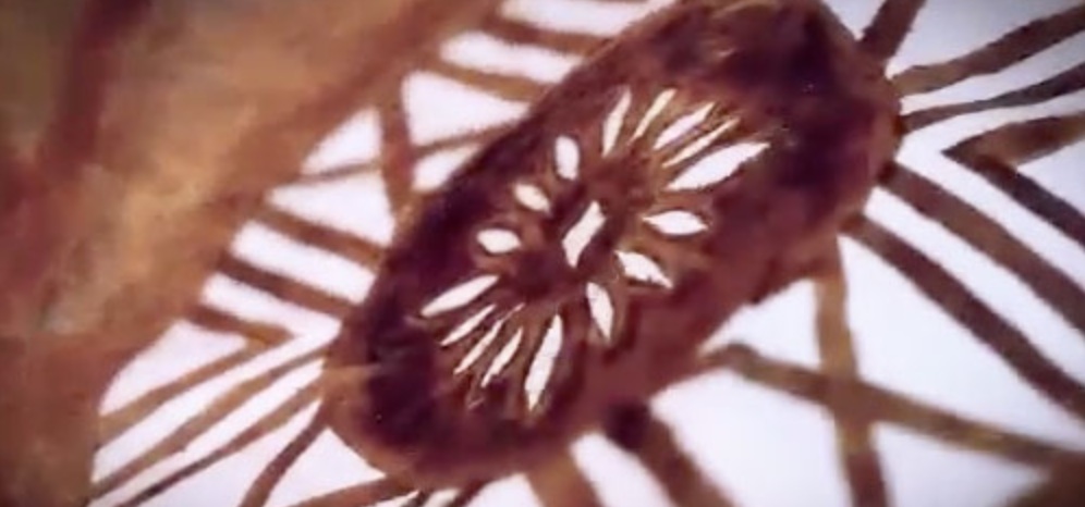
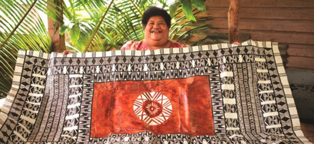
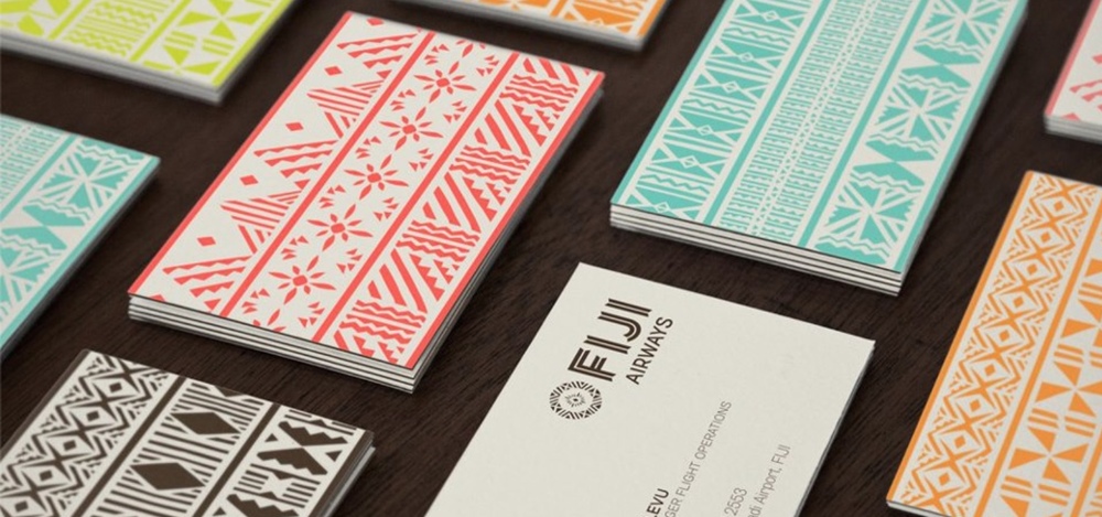
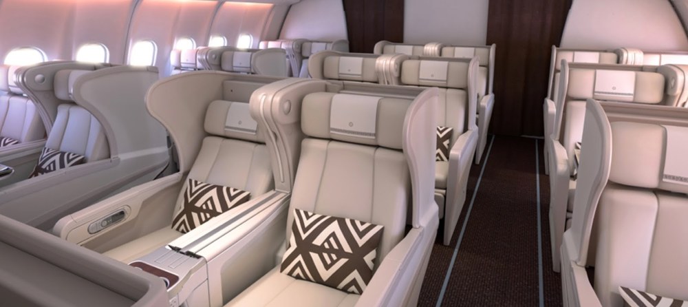
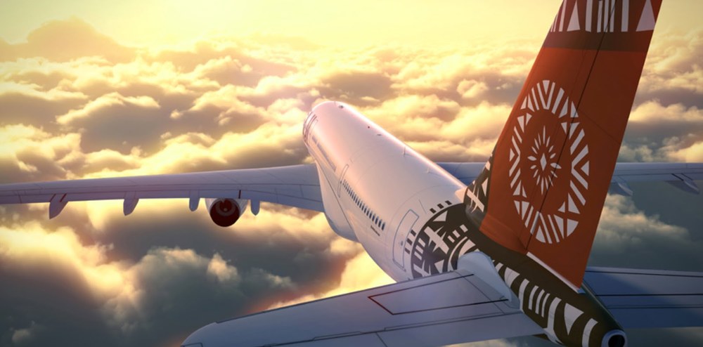
In an effort to avoid talking about recent disasters in airline rebranding, it seemed a good time to shine a light on a brilliant redesign that was released a few months ago. Fiji Airways unveiled their new logo back in August, and then followed with their new livery design on Fiji Day in October. The logo and look are based on a regional style of art called Masi, (or Tapa), which is commonly done on cloth with geometric stenciled patterns carved from the bark or roots of the Masi tree. As the hallmark of their rebranding from Air Pacific (though they used the word Fiji on their rainbow-colored tail fin), they hired a Fijian Masi artist, Makereta Matemosi, to design a Masi symbol specifically for them. The resulting logo is clean and bold, but full of meaning, with multiple layers of symbolism ranging from interconnection to community to love for Fiji baked into the elements of its rings. One of the best details is that they didn't clean up the symbol to the point of being perfect symmetrical geometry, instead leaving some imperfect angles and lines. In addition to the logo, they used similar Masi designs with other meanings in the rest of their branding in everything from the fuselage to the pillows to business cards, but always in a clean, restrained manner and never overdone. It's worth pointing out that a handmade reference could easily end up going wrong when dealing with something like air travel - all the more reason to praise a solution that not only dared to go that route, but succeeded in doing so in such a bold and confident way. An exec for the airlines said, "our goal was to create a new symbol that was distinctly Fijian and one that would stand out even at the most crowded international airport." Even in earth tones, they succeeded with flying colors.