what in the world...


Over the past weeks, the World Cup captured the attention of more than ever before. One unfortunate side of this, however, is that many were witness to a truly terrible piece of design. I think I saw this logo in small parts of the screen and page many times before I even realized that it WAS the logo for this years World Cup. A bunch of smiley faces is the logo for global athletic competition?? Surely someone made a mistake. This one is so bad, I'm just speechless. I don't know where to begin.
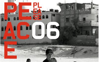
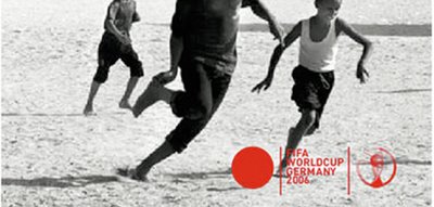
Apparently, I wasn't alone. The German design community was so embarassed by the World Cup logo that a group of designers formed a group they called "alternatives" and presented 11 different designs and campaigns in January of 2003 in an effort to get the World Cup to recall their logo. Obviously, they didn't. But they did get the chance to show off some really great solutions. Aside from the smiley face monstrosity, these are some of my favorites. Take some time to peruse them yourself (be sure to click the links like 'move' and 'campaign' for more on each piece - and be sure that you've clicked "en": for the english version of the site.
and again - just to be clear - the smiley faces at the top of this post are the actual 2006 World Cup logo (really, no joke). The designs below it are some of the 11 good alternatives proposed by German designers.
