worlds apart


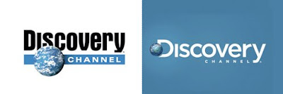
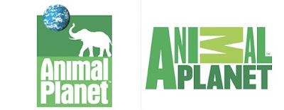
Discovery Communications is one of those quiet giants in the cable industry. Several years ago, they redesigned most of their networks to somehow incorporate the Discovery globe as a nod to their being part of the Discovery family. Not all networks did - TLC never did, nor did the newer Military Channel. Some incorporated it in ways that worked well, like Animal Planet; others, not so much - like FitTV. This kind of corporate strategy always seems to yield mixed results. Is it smart to try to leverage the brand equity of your main corporate? Or does it lead to a backlash? I recall back in the 80's when some corporation started putting a red stripe with a logo on the commercials of all of their products - and it was vast the amount of products and brands this otherwise unknown company owned. Rather than the intended message of "look how many good things we are a part of", the reaction was more like "who are these guys and why do they have a hand in so many things that are part of my life?" They quickly dropped the corporate logo from the commercials. But I digress. I don't know that Discovery ever had that kind of reaction to their overall branding scheme, but for whatever reason, they have been launching redesigns of their networks that drop the connections to the parent Discovery globe (as shown in the above images stolen from the UnderConsideration website "Brand New"). It does make sense that there is more to be gained from giving networks their own identity, along with eliminating the risk that the image of one of the "lesser" networks would bring down the image of its flagship Discovery Channel. The Discovery Channel itself is the latest to rebrand. While not perfect, they have done a really nice update that modernizes the typography and keeps the globe a key element, but makes it less overbearing. The new logo was done by Viewpoint Creative. My favorite of the new logos is the one for the Science Channel. Their old logo was probably one of the worst in television history, so granted, there was nowhere to go but up. The new logo plays off of the periodic table, a concept that I think is a genius way to say "science" without using the expected cliches. It also results in a logo that is amazingly simple and clear. The typography is a little too clever for its own good - shaving the upper left notch off the Avant Garde n's makes the type harder to read and unnecessarily trendy. The flush right alignment of the words is nice, but then centering them under the box instead of aligning them under the right edge also makes no sense. Still, the main box/Sc logo is so strong that the little flaws become forgivable. The new Science Channel logo was designed by their in-house team. And then there's Animal Planet. This logo design seems to inspire the same love/hate as the 2012 Olympic logo. On one hand, I like it for its daring. Its so out of the ordinary and unconventional, that I applaud that. Distinctive? Absolutely. My issues with it fall more to just how badly its done - unless thats intentional - but I cant tell. And if its intentional, I think you should be able to tell. The thickness (or lack thereof) of the N and the A compared to the thickness of the I and the L - thats just wacky to me. I've heard that its supposed to look as thought it was created by animals. ("I can haz Animulz Planetz?") Maybe so, but I think even animals know that you don't stretch type. I expected the on-air package to take advantage of the dramatic jagged shapes created by counterspaces of the M - maybe to give a feeling of teeth or jungle or just some dramatic motion, but that doesn't seem to have materialized either. The new Animal Planet logo was designed by London-based Dunning Eley Jones. Overall, I think Discovery is on a good track. The differences among the networks personalities outweigh their similarities, and having distinctly different identities will allow them to thrive.
