
mistified
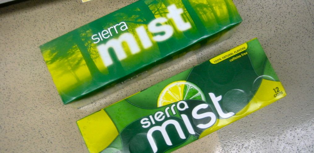
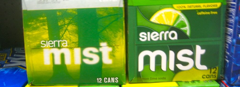
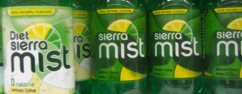
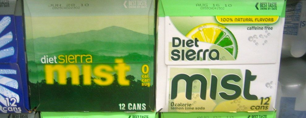
About a year and a half ago, Pepsi made a huge splash be redesigning their packaging and logo. Along with Pepsi-named products were the redesigns of its ancillary brands like Tropicana, Gatorade, Mountain Dew, and Sierra Mist. The Tropicana redesign is the stuff of legend. Consumers revolted, and they changed the packaging back in a matter of weeks. I have to admit I've never cared for Tropicana's packaging and was a (maybe the only) fan of their redesign, but I also don't have any emotional connection to the brand like apparently its consumers do. While I hate Pepsi's new logo, I like the new packaging (with the exception of the globe logo.) Of course, Pepsi's packaging was some of the worst, so most anything would have been an improvement. Which brings me to Sierra Mist. It was - well - mystifying. Its old packaging was typically overdone and looked the same as every lemon-lime drink out there. The redesign seemed an attempt to be clean, but also an attempt to dig deeper into the name with the misty blurred type and forested background. Only the color palette referred to the flavor. But, well even now I'm at a loss for words. Nice try and points for being different, but it still missed the mark. The other day I noticed yet another new label alongside the old one at the grocery store. I always love finding an old vs new label change in its proper environment. And the new one - well, not much good to say for it either. Its cheesy, trite, and expected; an overdone background, fake condensation bubbles, outlined type and of course, lemon and lime wedges - back to looking like every other lemon-lime drink out there. At least they resisted the drop shadows and beveled edges. It could certainly be worse, but its basically mediocre to mediocre. Not very refreshing.